Background
A lot has changed since the last blog post. After a few playtesting sessions, we’ve collected some valuable feedback and started to have a clearer direction of how we want our game to look and feel. We always knew we wanted to make a stylized retro/PS1 looking game, but this is not as simple as reducing the resolution of the game to give it a pixelated look.
Overhauling the Game Assets
The First change was to the game assets. My teammates made some initial assets to make our game slightly more visually pleasing to look at than simply blank cubes jumping around in the default Unity skybox. These assets were simple, mostly made of primitive shapes with boolean modifiers, and some basic modeling. Though these assets worked for a prototype (which we were building), I felt like some other groups had better aesthetics and felt like we could do better with our assets. I also wanted to optimize and clean up some very minor issues we faced in development. So I decided to overhaul the assets and make them look nicer.
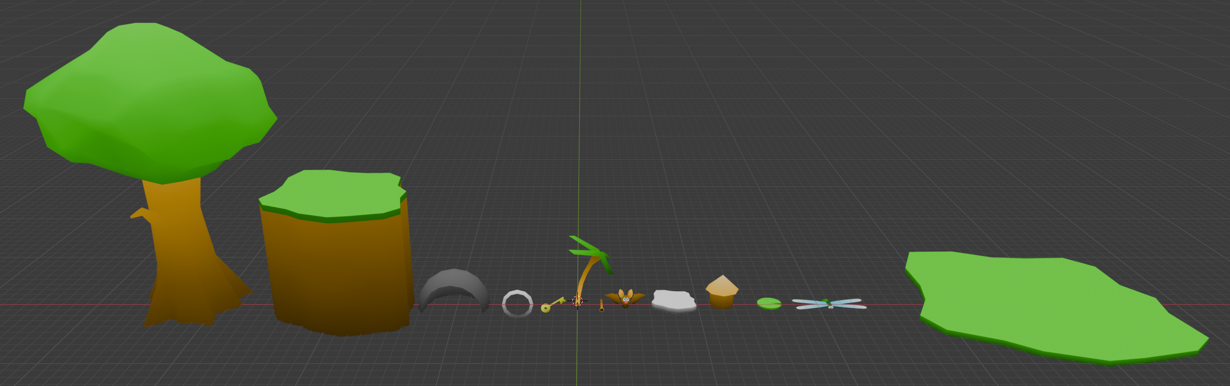
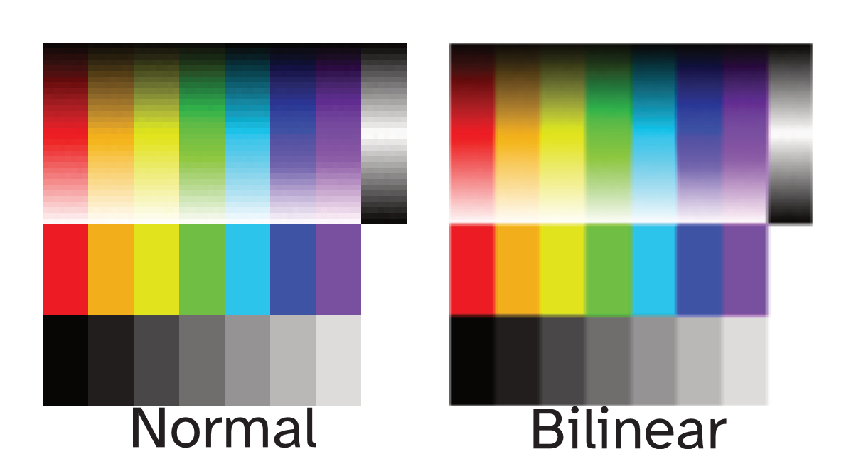
Before, each asset was divided into multiple parts based on what color it would be, so that each part can have its own material with its own color. So I wanted to consolidate the parts of each asset into one mesh per asset. I textured using a technique I’ve seen in this video, so we’d be able to have one material for everything instead of one material per color. And, because of that technique, all models share one texture that is only 64x64 pixels. This texture had some simple gradients, so we can create the impression of shadows. Since modern graphics use bilinear filtering to smooth out pixels, this texture produces smooth gradients even though the texture uses about 32 shades per color. To get closer to our intended PS1 style for our game, I wanted to try using flat, toon style shading, and get rid of the shadows you get from the game engine. (although one could argue that the PS1 didn’t use bilinear filtering like we are abusing here.)
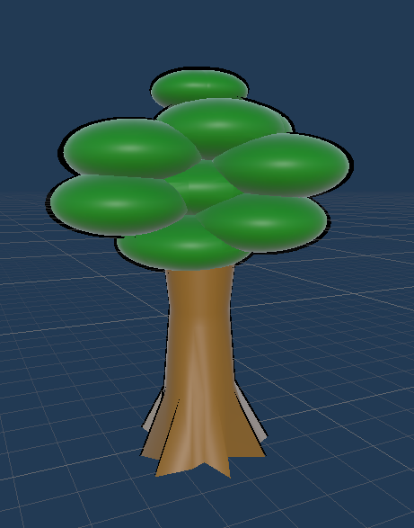
We wanted to allow the player to collide and interact with the objects, so we wanted to use mesh colliders for some items rather than primitive colliders. The old tree (pictured below) we used was made of several spheroid shapes that were booleaned together, but this actually caused Unity to complain about how high poly this would be for a mesh collider. So instead, I took an icosphere and shrink-wrapped it to the top of the old tree to get the poly count down to about 25% of the old tree.
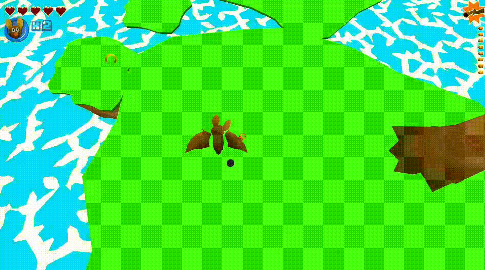
The bat and dragonfly character had separate mesh for the wings, so they can be animated. Since the models were relatively simple, I decided to merge everything into one mesh and rig the wings so that we can animate the bones in Unity just like we did with the seperated wings. I also decided to rig a bit more things to give us a bit more freedom with posing of our characters. So now, the head, body, eyes, and wings can all be posed in Unity.
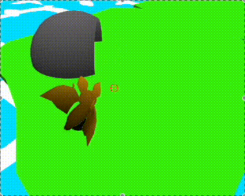
The bat’s head moves to look where the player is facing
Also, if you notice from the last gif, the movement of the water as if it had cartoony foam and current. This was created using a custom shader made with Unity’s shader graphs. Using voronoi noise, you can generate the natural wavy motion that you associate with ocean currents. However, I realized that Unity’s included voronoi node does not work like how I want it to. I found this tutorial showing a custom voronoi generator, which behaves closer to what I need. And add some variation and motion to this voronoi, and we get a convincing cartoony water shader.
Finally, I also started working on a user interface. It includes a display of how many lives the player has, their health, what gun is equipped, how many bullets are in the gun, and even a dialog box (which also supports symbols for conveying keyboard, mouse, and gamepad controls; perfect for a tutorial). A few of the assets (such as button icons, the dialog box background, font, and symbols) are royalty-free assets from Kenney (great place to find some basic assets by the way). The other in-game icons I created using a combination of Blender and Affinity Designer.
New Controllers
After I created these new assets, I realized I’d need to convert all the old prefabs to use the new assets or recreate all the prefabs from scratch and then recreate all previous levels. One other “problem” (more like a mistake rather than causing any real issue) is that the old assets weren’t aligned to the world’s origin. So this meant all new assets (which I ensured to apply all transform information to) would need to be offset to maintain the positions of the old assets. I decided it would probably be easier for me to just create new prefabs and deprecate the old ones.
We were also facing issues where the player would get a lot of unexpected force when firing their gun downward, which needed to be fixed in programming. I also kept rebuilding the structure of the player every so often, which involved adding back the camera controller and gun controller as child objects to the main player controller. This became tedious to do multiple times, so I decided to scrap these controllers and rewrite all controls to just be on the player.
Recreating the controllers allows me to improve the structure of the logic as I recognize what I could have implemented differently. Previously, the gun controller and the camera controller kinda depended on the player and each other, meaning a variable that has to be created in each script, which also needs to be set in the Unity editor each time. Now that everything is in one script, all these parts are able to seamlessly interact with each other with fewer steps to set everything up.
The controls for the gun have been changed to be much simpler. Instead, all the behavior of the gun has been moved to a new “gun” object, while the player just pulls and releases the gun’s trigger. This way, we have the flexibility of adding multiple guns (that the player can pick up this time rather than starting at spawn). Each gun could have vastly different behavior such as being an automatic weapon, having a different fire pattern, firing multiple bullets, different recoil strength, etc.
I also wanted to improve the camera system. I added a feature where the camera would test whether it would be occluded by walls and go as far from the player as it could. However, I previously had the camera line trace from the player to an offset focus point, then from the offset focus point to going back a certain distance. These two traces led to unpredictable results in certain cases when the player is near a wall, so instead I made it do one trace from the player to where the camera should be if not occluded. This gives a more predictable control for the camera as it only moves across one axis.
Finally, one piece of feedback we received was that the bullets from the gun don’t feel like it goes where the crosshair is. This was true as the crosshair was really just to signify where the center of the screen is to the player. If the bullet went forward infinitely, it did get closer to the crosshair, but players would likely be shooting at things that are nearer to them. To solve this, I performed a line trace starting from the camera going out in the camera’s direction to see what the player is currently looking at. Then I make the gun aim at that point. As you may have previously seen, I also made the player’s head look towards what the camera is facing as well.
Try the Prototype
I made a build of the prototype for the HTML5 target, so I can post it on this very blog. You can try this sprint’s systems prototype, or the previous sprint’s kinesthetic prototype (unfortunately missed writing a blog post on this one). If you do, and you have any feedback, feel free to drop a comment below!